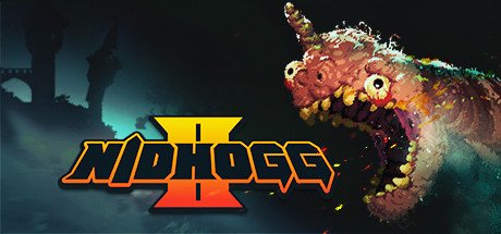
Return of the wurm! The next installment of the epic award-winning dueling tug-of-war is coming! Destroy your opponents with all new moves and weapons across ten different arenas. Enjoy new monstrous visuals by artist Toby Dixon and bangin Beats from Daedelus, Mux Mool, Doseone, and more! Coming in 2017.
Last edited by prudislav on Thu, 29th Sep 2016 17:36; edited 1 time in total
Grab that second controller and start planning the party — we are super-excited to say that Nidhogg 2 is launching August 15th, with pre-orders beginning July 18th.
You may have noticed that Nidhogg 2 looks ever-so-slightly different from its predecessor. It’s the number one thing that people ask about, so Kristy and I wanted to give you the story behind Nidhogg 2’s art direction.
Born of Limitation
We were proud of the original Nidhogg’s visual style, but that’s not to say we weren’t a bit surprised by how well the chunky, featureless pixels were received. We were pushing the limits of old-school aesthetics, after all. What many people didn’t realize was that Nidhogg’s style actually grew out of practicality more than some daring vision.
Nidhogg was a game of fast reactions and precision, so fluid animation was a major priority. The flat style meant that I could iterate quickly, drawing and adjusting animations on the fly without having to worry about matching dozens of intricate design elements between frames.
Rather than setting up mechanics and then moving on to art, I’m someone who needs to be able to tweak both constantly. The major drawback to this approach is that adding any sort of detail, like a piece of armor or a mask, means hours upon hours spent redoing animations again and again. While these limitations helped to define Nidhogg’s distinctive style, we felt constrained.
New Game, New Process
When Kristy and I started thinking about Nidhogg 2, we looked back at our general to-do list from the original game. As always, there were a lot of items that had drifted from “Gotta hav this,” to “Wanna do this if we have time,” and on to “Can’t really do this, but man it would be cool.” Of everything on that list, a new animation process sat at the top.
I had been experimenting with 2D bone animation programs, which allow you to independently animate separate body parts instead of redrawing entire character sprites. This makes it infinitely easier to combine things like fencing footwork, various upper-body stances, and weapon types. Plus, it means you can swap out the sprites without breaking the animation.
It seemed silly to use all this potential on pixelated stick figures. So, instead of minimalism, why not try out some maximalism? Animated faces, sweet outfits and hairstyles, bustling environments – the doors had swung wide and Nidhogg 2’s visual style was born.
While it might take a few moments to adjust to the new look, we think you’ll enjoy this lively new world with all its visual absurdity and fun character possibilities. I know that we’ve certainly had a blast creating it.
Looks like they're going for a completely different art-style this time around, from minimalistic sketches to...the bizarro version of The Simpsons on crack
The first game was surprisingly pleasant in its fast (yet tactical-ish) approach though, here's hoping they can maintain that at least.
Signature/Avatar nuking: none (can be changed in your profile)
You cannot post new topics in this forum You cannot reply to topics in this forum You cannot edit your posts in this forum You cannot delete your posts in this forum You cannot vote in polls in this forum